鸿蒙HarmonyOS NEXT个人中心页面布局深度解析
项目演示
第一章 鸿蒙HarmonyOS NEXT与ArkTS概述
1.1 HarmonyOS NEXT 简介
HarmonyOS NEXT 是华为推出的新一代操作系统,采用全新的微内核架构,具备分布式软总线、分布式数据管理、分布式任务调度等核心能力。它支持多种设备形态,包括手机、平板、智能穿戴、智慧屏等,实现了真正意义上的万物互联。
1.2 ArkTS 编程语言
ArkTS 是 HarmonyOS NEXT 的主力开发语言,基于 TypeScript 扩展而来,保留了 TypeScript 的类型安全特性,并增加了声明式 UI、状态管理、生命周期管理等面向 UI 开发的特性。
ArkTS 的核心优势:
- 声明式 UI 编程:通过描述 UI 状态而非命令式操作来构建界面
- 类型安全:编译期类型检查,减少运行时错误
- 响应式状态管理:状态变化自动触发 UI 更新
- 组件化开发:支持自定义组件,提高代码复用性
1.3 开发环境搭建
要开发 HarmonyOS NEXT 应用,需要安装以下工具:
- DevEco Studio:官方 IDE,基于 IntelliJ IDEA 构建
- HarmonyOS SDK:包含开发所需的 API 和工具链
- Node.js:用于构建和依赖管理
1.4 项目结构概览
一个典型的 HarmonyOS NEXT 应用项目结构如下:
MyApplication/
├── entry/                           # 应用入口模块
│   ├── src/
│   │   └── main/
│   │       ├── ets/                 # ArkTS 源码目录
│   │       │   ├── pages/           # 页面目录
│   │       │   │   └── Index.ets    # 首页
│   │       │   ├── components/      # 自定义组件目录
│   │       │   ├── viewmodel/       # 视图模型目录
│   │       │   └── App.ets          # 应用入口文件
│   │       └── resources/           # 资源目录
│   │           ├── base/
│   │           │   ├── media/       # 媒体资源
│   │           │   ├── string/      # 字符串资源
│   │           │   ├── color/       # 颜色资源
│   │           │   └── float/       # 浮点资源
│   │           └── rawfile/         # 原始文件资源
│   └── module.json5                 # 模块配置文件
└── hvigorfile.ts                    # 构建脚本
第二章 个人中心页面设计理念
2.1 个人中心页面的重要性
个人中心页面是移动应用中最重要的页面之一,它承担着以下核心功能:
- 用户信息展示:头像、昵称、等级、积分等
- 功能入口聚合:钱包、订单、收藏、设置等
- 个性化设置:主题、通知、隐私等
一个设计良好的个人中心页面能够提升用户体验,增强用户粘性。
2.2 设计原则
1. 视觉层次分明
- 顶部用户信息卡片作为视觉焦点
- 功能菜单网格提供快速访问
- 设置列表展示详细配置选项
2. 信息密度适中
- 避免信息过载,合理分组
- 使用卡片式设计隔离不同功能区块
- 留白适当,提升阅读舒适度
3. 交互友好
- 清晰的点击反馈
- 角标提示未读消息
- 平滑的页面滚动
4. 响应式适配
- 适配不同屏幕尺寸
- 横屏竖屏自动调整布局
- 字体大小适配
2.3 布局结构设计
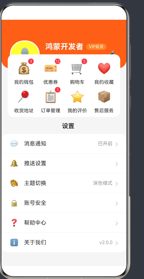
本示例采用以下三层布局结构:
┌─────────────────────────────────────┐
│  用户信息卡片(Row布局)             │
│  ┌──────┬──────────────┬───────┐   │
│  │头像  │ 昵称/等级     │编辑   │   │
│  │      │ 积分/余额     │按钮   │   │
│  └──────┴──────────────┴───────┘   │
├─────────────────────────────────────┤
│  功能菜单网格(Grid布局)            │
│  ┌────┬────┬────┬────┐             │
│  │钱包│优惠券│购物车│收藏│          │
│  ├────┼────┼────┼────┤             │
│  │地址│订单│评价│售后│             │
│  └────┴────┴────┴────┘             │
├─────────────────────────────────────┤
│  设置列表(List布局)               │
│  ┌───────────────────────────────┐  │
│  │ 消息通知    已开启      ›     │  │
│  ├───────────────────────────────┤  │
│  │ 推送设置                ›     │  │
│  ├───────────────────────────────┤  │
│  │ ...                          │  │
│  └───────────────────────────────┘  │
└─────────────────────────────────────┘
第三章 核心布局组件详解
3.1 Column 与 Row 组件
Column 和 Row 是 ArkUI 中最基础的布局组件,用于构建垂直和水平方向的线性布局。
3.1.1 Column 组件
Column 组件将子组件按照垂直方向排列:
Column() {
  Text('第一行')
  Text('第二行')
  Text('第三行')
}
.width('100%')
.height('100%')
常用属性:
| 属性 | 类型 | 说明 |
|---|---|---|
| space | number | 子组件之间的间距 |
| alignItems | HorizontalAlign | 水平对齐方式 |
| justifyContent | FlexAlign | 垂直对齐方式 |
水平对齐方式:
HorizontalAlign.Start:左对齐HorizontalAlign.Center:居中对齐HorizontalAlign.End:右对齐
垂直对齐方式:
FlexAlign.Start:顶部对齐FlexAlign.Center:居中对齐FlexAlign.End:底部对齐FlexAlign.SpaceBetween:两端对齐,间距均匀分布FlexAlign.SpaceAround:间距均匀分布,两端各有一半间距FlexAlign.SpaceEvenly:间距均匀分布,包括两端
3.1.2 Row 组件
Row 组件将子组件按照水平方向排列:
Row() {
  Text('左')
  Text('中')
  Text('右')
}
.width('100%')
.height(50)
常用属性:
| 属性 | 类型 | 说明 |
|---|---|---|
| space | number | 子组件之间的间距 |
| alignItems | VerticalAlign | 垂直对齐方式 |
| justifyContent | FlexAlign | 水平对齐方式 |
垂直对齐方式:
VerticalAlign.Top:顶部对齐VerticalAlign.Center:居中对齐VerticalAlign.Bottom:底部对齐
3.1.3 嵌套布局示例
在个人中心页面中,我们大量使用嵌套布局:
Row() {
  // 头像区域
  Stack() {
    Circle().width(80).height(80).fill('#FFFFFF33')
    Text('👤').fontSize(36)
  }
  .margin({ right: 16 })

  // 用户信息区域
  Column({ space: 8 }) {
    Row({ space: 8 }) {
      Text(this.userInfo.nickname)
        .fontSize(22)
        .fontWeight(FontWeight.Bold)

      Text(this.userInfo.level)
        .fontSize(12)
        .backgroundColor('#FF8C42')
        .padding({ left: 8, right: 8, top: 2, bottom: 2 })
        .borderRadius(10)
    }

    Row({ space: 20 }) {
      Column({ space: 4 }) {
        Text('积分').fontSize(12)
        Text(`${this.userInfo.points}`).fontSize(16)
      }

      Column({ space: 4 }) {
        Text('余额').fontSize(12)
        Text(`¥${this.userInfo.balance}`).fontSize(16)
      }
    }
  }

  // 编辑按钮
  Blank()

  Text('✏️').fontSize(20)
}
3.2 Grid 组件
Grid 组件用于构建网格布局,适用于展示多个功能入口。
3.2.1 基本用法
Grid() {
  ForEach(this.menuList, (item, index) => {
    GridItem() {
      Column() {
        Text(item.icon).fontSize(32)
        Text(item.label).fontSize(14)
      }
      .justifyContent(FlexAlign.Center)
      .alignItems(HorizontalAlign.Center)
    }
  }, (item, index) => `${index}`)
}
.columnsTemplate('1fr 1fr 1fr 1fr')
.rowsTemplate('1fr 1fr')
.columnsGap(16)
.rowsGap(16)
关键属性:
| 属性 | 类型 | 说明 |
|---|---|---|
| columnsTemplate | string | 列模板,使用 fr 单位 |
| rowsTemplate | string | 行模板,使用 fr 单位 |
| columnsGap | number | 列间距 |
| rowsGap | number | 行间距 |
| gridDirection | GridDirection | 网格排列方向 |
fr 单位说明:
fr(fraction)是一种弹性单位,表示剩余空间的比例。例如 '1fr 1fr 1fr 1fr' 表示将空间平均分成4份,每列占1份。
3.2.2 自适应网格
Grid 组件支持通过 columnsTemplate 实现响应式布局:
// 手机端:4列
.columnsTemplate('1fr 1fr 1fr 1fr')

// 平板端:6列
.columnsTemplate('1fr 1fr 1fr 1fr 1fr 1fr')
3.2.3 功能菜单网格实现
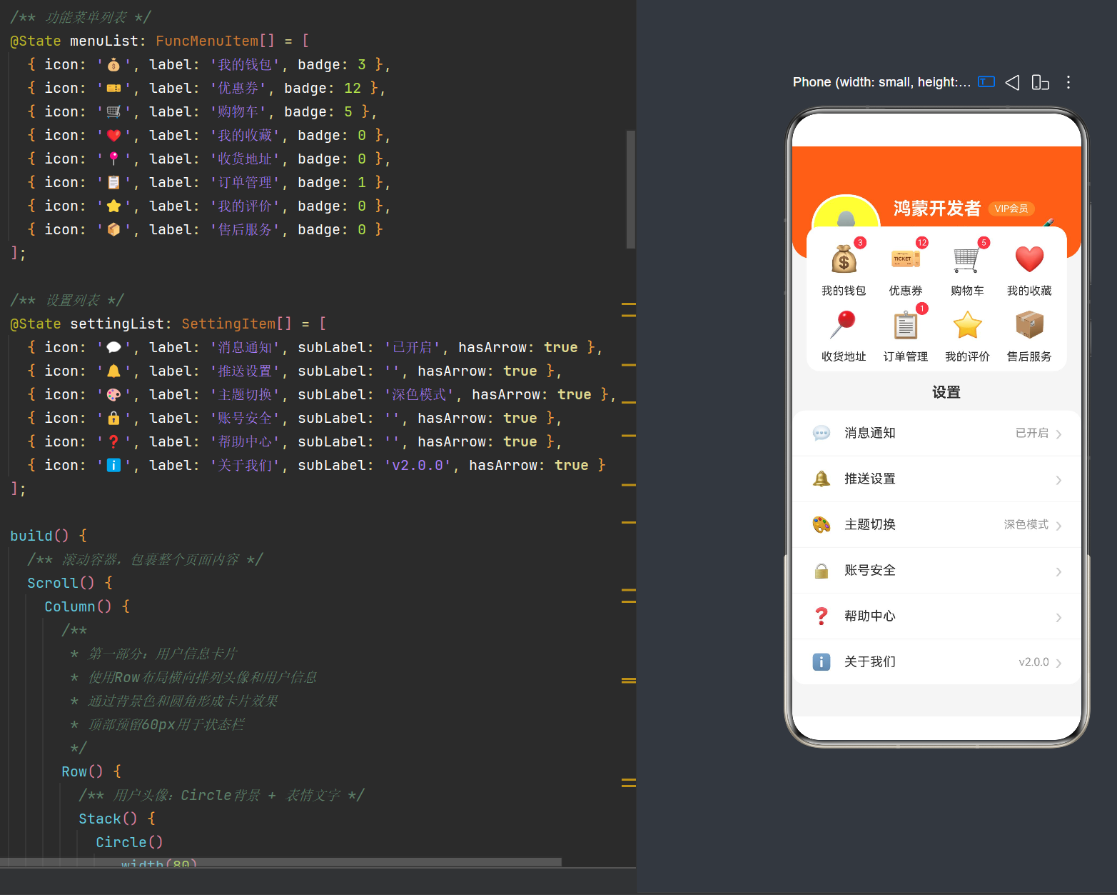
在个人中心页面中,Grid 用于展示8个功能入口:
Grid() {
  ForEach(this.menuList, (item: FuncMenuItem, index: number) => {
    GridItem() {
      Column({ space: 8 }) {
        Stack() {
          Text(item.icon).fontSize(32)

          if (item.badge && item.badge > 0) {
            Text(`${item.badge}`)
              .fontSize(10)
              .fontColor('#FFFFFF')
              .backgroundColor('#FF4D4F')
              .width(16)
              .height(16)
              .textAlign(TextAlign.Center)
              .borderRadius(8)
              .position({ right: -4, top: -4 })
          }
        }
        .width(48)
        .height(48)

        Text(item.label)
          .fontSize(14)
          .fontColor('#333333')
      }
      .width('100%')
      .height('100%')
      .justifyContent(FlexAlign.Center)
      .alignItems(HorizontalAlign.Center)
    }
  }, (item: FuncMenuItem, index: number) => `${index}`)
}
.width('90%')
.height(180)
.backgroundColor('#FFFFFF')
.borderRadius(16)
.margin({ top: -40, bottom: 16 })
.shadow({ radius: 4, color: '#0000001A', offsetY: 2 })
.columnsTemplate('1fr 1fr 1fr 1fr')
.rowsTemplate('1fr 1fr')
.columnsGap(16)
.rowsGap(16)
.padding(16)
3.3 List 组件
List 组件用于构建滚动列表,适用于展示大量数据。
3.3.1 基本用法
List({ space: 1 }) {
  ForEach(this.settingList, (item, index) => {
    ListItem() {
      Row() {
        Text(item.icon).fontSize(20)
        Text(item.label).fontSize(16).flexGrow(1)
        Text('›').fontSize(24).fontColor('#CCCCCC')
      }
      .padding({ left: 24, right: 24 })
      .height(56)
    }
  }, (item, index) => `${index}`)
}
.width('100%')
关键属性:
| 属性 | 类型 | 说明 |
|---|---|---|
| space | number | 列表项之间的间距 |
| initialIndex | number | 初始滚动位置 |
| listDirection | Axis | 滚动方向 |
| scroller | Scroller | 滚动控制器 |
3.3.2 ListItem 组件
ListItem 是 List 的子组件,代表列表中的一项:
ListItem() {
  // 列表项内容
}
.alignListItem(ListItemAlign.Start)
3.3.3 设置列表实现
在个人中心页面中,List 用于展示设置项:
List({ space: 1 }) {
  ForEach(this.settingList, (item: SettingItem, index: number) => {
    ListItem() {
      Row() {
        Text(item.icon)
          .fontSize(20)
          .margin({ right: 16 })

        Text(item.label)
          .fontSize(16)
          .fontColor('#333333')
          .flexGrow(1)

        if (item.subLabel) {
          Text(item.subLabel)
            .fontSize(14)
            .fontColor('#999999')
            .margin({ right: 8 })
        }

        if (item.hasArrow) {
          Text('›')
            .fontSize(24)
            .fontColor('#CCCCCC')
        }
      }
      .width('100%')
      .height(56)
      .padding({ left: 24, right: 24 })
      .backgroundColor('#FFFFFF')
    }
  }, (item: SettingItem, index: number) => `${index}`)
}
.width('100%')
.borderRadius(16)
.margin({ bottom: 20 })
3.4 Stack 组件
Stack 组件用于堆叠子组件,实现层叠效果。
3.4.1 基本用法
Stack() {
  // 底层组件
  Circle().width(80).height(80).fill('#FFFFFF33')

  // 上层组件
  Text('👤').fontSize(36)
}
常用属性:
| 属性 | 类型 | 说明 |
|---|---|---|
| alignContent | Alignment | 内容对齐方式 |
| fitContent | boolean | 是否自适应内容大小 |
3.4.2 角标实现
Stack 常用于实现角标效果:
Stack() {
  Text(item.icon).fontSize(32)

  if (item.badge && item.badge > 0) {
    Text(`${item.badge}`)
      .fontSize(10)
      .fontColor('#FFFFFF')
      .backgroundColor('#FF4D4F')
      .width(16)
      .height(16)
      .textAlign(TextAlign.Center)
      .borderRadius(8)
      .position({ right: -4, top: -4 })
  }
}
.width(48)
.height(48)
3.5 Scroll 组件
Scroll 组件用于创建可滚动区域。
3.5.1 基本用法
Scroll() {
  Column() {
    // 内容区域
  }
}
.width('100%')
.height('100%')
常用属性:
| 属性 | 类型 | 说明 |
|---|---|---|
| scrollBar | BarState | 滚动条状态 |
| scrollable | boolean | 是否可滚动 |
| edgeEffect | EdgeEffect | 边缘效果 |
滚动条状态:
BarState.Auto:自动显示/隐藏BarState.On:始终显示BarState.Off:始终隐藏
3.5.2 页面滚动实现
在个人中心页面中,Scroll 包裹整个页面内容:
Scroll() {
  Column() {
    // 用户信息卡片
    // 功能菜单网格
    // 设置列表
    // 底部安全区域
  }
  .width('100%')
  .backgroundColor('#F5F5F5')
}
.width('100%')
.height('100%')
第四章 状态管理与数据结构
4.1 @State 装饰器
@State 是 ArkTS 中最基础的状态管理装饰器,用于管理组件内部的状态。
4.1.1 基本用法
@State userInfo: UserInfo = {
  avatar: '',
  nickname: '鸿蒙开发者',
  level: 'VIP会员',
  points: 8888,
  balance: 128.50
};
状态更新机制:
当 @State 修饰的变量发生变化时,ArkUI 框架会自动触发组件的重新渲染,更新相关的 UI 组件。
4.1.2 状态更新示例
@State count: number = 0;

build() {
  Column() {
    Text(`计数: ${this.count}`)
      .fontSize(24)

    Button('点击增加')
      .onClick(() => {
        this.count++;
      })
  }
}
4.2 数据结构设计
良好的数据结构设计是构建高质量应用的基础。
4.2.1 用户信息接口
interface UserInfo {
  avatar: string;
  nickname: string;
  level: string;
  points: number;
  balance: number;
}
字段说明:
| 字段 | 类型 | 说明 |
|---|---|---|
| avatar | string | 头像地址 |
| nickname | string | 用户昵称 |
| level | string | 用户等级 |
| points | number | 积分数量 |
| balance | number | 账户余额 |
4.2.2 功能菜单接口
interface FuncMenuItem {
  icon: string;
  label: string;
  badge?: number;
}
字段说明:
| 字段 | 类型 | 说明 |
|---|---|---|
| icon | string | 图标(emoji或资源路径) |
| label | string | 功能名称 |
| badge | number | 角标数量(可选) |
4.2.3 设置项接口
interface SettingItem {
  icon: string;
  label: string;
  subLabel?: string;
  hasArrow: boolean;
}
字段说明:
| 字段 | 类型 | 说明 |
|---|---|---|
| icon | string | 图标 |
| label | string | 设置项名称 |
| subLabel | string | 辅助说明(可选) |
| hasArrow | boolean | 是否显示箭头 |
4.3 数据初始化
在组件内部初始化状态数据:
@State userInfo: UserInfo = {
  avatar: '',
  nickname: '鸿蒙开发者',
  level: 'VIP会员',
  points: 8888,
  balance: 128.50
};

@State menuList: FuncMenuItem[] = [
  { icon: '💰', label: '我的钱包', badge: 3 },
  { icon: '🎫', label: '优惠券', badge: 12 },
  { icon: '🛒', label: '购物车', badge: 5 },
  { icon: '❤️', label: '我的收藏', badge: 0 },
  { icon: '📍', label: '收货地址', badge: 0 },
  { icon: '📋', label: '订单管理', badge: 1 },
  { icon: '⭐', label: '我的评价', badge: 0 },
  { icon: '📦', label: '售后服务', badge: 0 }
];

@State settingList: SettingItem[] = [
  { icon: '💬', label: '消息通知', subLabel: '已开启', hasArrow: true },
  { icon: '🔔', label: '推送设置', subLabel: '', hasArrow: true },
  { icon: '🎨', label: '主题切换', subLabel: '深色模式', hasArrow: true },
  { icon: '🔒', label: '账号安全', subLabel: '', hasArrow: true },
  { icon: '❓', label: '帮助中心', subLabel: '', hasArrow: true },
  { icon: 'ℹ️', label: '关于我们', subLabel: 'v2.0.0', hasArrow: true }
];
第五章 样式与主题
5.1 基础样式属性
ArkUI 组件提供了丰富的样式属性,用于控制组件的外观。
5.1.1 尺寸属性
| 属性 | 类型 | 说明 |
|---|---|---|
| width | string | number | 宽度 |
| height | string | number | 高度 |
| minWidth | string | number | 最小宽度 |
| minHeight | string | number | 最小高度 |
尺寸单位:
px:像素单位vp:虚拟像素单位(推荐)%:百分比单位fr:弹性单位
5.1.2 边距与内边距
| 属性 | 类型 | 说明 |
|---|---|---|
| margin | Margin | 外边距 |
| padding | Padding | 内边距 |
示例:
.margin({ left: 24, right: 24, top: 10, bottom: 10 })
.padding({ left: 16, right: 16 })
5.1.3 背景与边框
| 属性 | 类型 | 说明 |
|---|---|---|
| backgroundColor | ResourceColor | 背景色 |
| border | BorderOptions | 边框 |
| borderRadius | Length | BorderRadius | 圆角 |
边框设置:
.border({ width: 3, color: Color.White })
.borderRadius(40)
5.1.4 阴影效果
.shadow({
  radius: 4,
  color: '#0000001A',
  offsetY: 2
})
阴影属性:
| 属性 | 类型 | 说明 |
|---|---|---|
| radius | number | 阴影模糊半径 |
| color | ResourceColor | 阴影颜色 |
| offsetX | number | 水平偏移 |
| offsetY | number | 垂直偏移 |
5.2 文本样式
Text 组件提供了丰富的文本样式属性。
5.2.1 字体属性
| 属性 | 类型 | 说明 |
|---|---|---|
| fontSize | Length | 字体大小 |
| fontWeight | number | FontWeight | 字重 |
| fontColor | ResourceColor | 字体颜色 |
| fontFamily | string | 字体族 |
字重常量:
FontWeight.Thin:100FontWeight.UltraLight:200FontWeight.Light:300FontWeight.Normal:400FontWeight.Medium:500FontWeight.SemiBold:600FontWeight.Bold:700FontWeight.ExtraBold:800FontWeight.Black:900
5.2.2 文本对齐
.textAlign(TextAlign.Center)
对齐方式:
TextAlign.Start:起始对齐TextAlign.Center:居中对齐TextAlign.End:末尾对齐
5.3 颜色系统
HarmonyOS 提供了完整的颜色系统。
5.3.1 颜色格式
// 十六进制颜色
.backgroundColor('#FF6B35')

// 带透明度的十六进制颜色
.fontColor('#FFFFFF99')

// 颜色常量
.backgroundColor(Color.White)

// RGB颜色
.backgroundColor(Color.rgb(255, 107, 53))

// RGBA颜色
.backgroundColor(Color.rgba(255, 107, 53, 0.5))
5.3.2 颜色资源
推荐将颜色定义在资源文件中:
// resources/base/color/color.json
{
  "color": [
    {
      "name": "primary_color",
      "value": "#FF6B35"
    },
    {
      "name": "text_color",
      "value": "#333333"
    }
  ]
}
使用时通过 $r 引用:
.backgroundColor($r('app.color.primary_color'))
5.4 卡片式设计
卡片式设计是现代UI设计的主流风格,具有以下特点:
- 圆角:使用
borderRadius创建圆角效果 - 阴影:使用
shadow添加深度感 - 背景色:使用白色背景与灰色分隔
- 内边距:适当的内边距提升内容可读性
卡片实现示例:
Grid() {
  // 内容
}
.width('90%')
.height(180)
.backgroundColor('#FFFFFF')
.borderRadius(16)
.shadow({ radius: 4, color: '#0000001A', offsetY: 2 })
.padding(16)
第六章 组件交互与事件处理
6.1 点击事件
点击事件是最常见的交互方式。
6.1.1 基本用法
Button('点击我')
  .onClick(() => {
    console.log('按钮被点击');
  })
6.1.2 列表项点击
ListItem() {
  Row() {
    // 内容
  }
  .onClick(() => {
    // 处理点击事件
  })
}
6.2 手势识别
ArkUI 提供了丰富的手势识别能力。
6.2.1 常用手势
| 手势 | 说明 |
|---|---|
| onClick | 点击手势 |
| onTouch | 触摸手势 |
| onPan | 滑动手势 |
| onPinch | 捏合手势 |
| onRotate | 旋转手势 |
6.2.2 手势识别器
GestureRecognizer({
  priority: 0
})
.onGestureEvent((event: GestureEvent) => {
  // 处理手势事件
})
6.3 导航与页面跳转
6.3.1 页面路由
import { router } from '@ohos.router';

// 跳转到新页面
router.pushUrl({
  url: 'pages/OrderPage'
});

// 返回上一页
router.back();

// 替换当前页面
router.replaceUrl({
  url: 'pages/LoginPage'
});
6.3.2 路由参数
// 跳转时传递参数
router.pushUrl({
  url: 'pages/OrderPage',
  params: {
    orderId: '123456'
  }
});

// 在目标页面接收参数
const orderId = router.getParams()?.['orderId'];
6.4 弹窗与提示
6.4.1 Toast 提示
import { promptAction } from '@ohos.promptAction';

promptAction.showToast({
  message: '操作成功',
  duration: 2000
});
6.4.2 对话框
import { promptAction } from '@ohos.promptAction';

promptAction.showDialog({
  title: '提示',
  message: '确定要退出吗?',
  buttons: [
    { text: '取消', color: '#999999' },
    { text: '确定', color: '#FF6B35' }
  ]
}).then((result) => {
  if (result.index === 1) {
    // 用户点击了确定
  }
});
第七章 性能优化
7.1 列表性能优化
对于大量数据的列表,需要进行性能优化。
7.1.1 使用 LazyForEach
LazyForEach 是一种惰性渲染机制,只渲染当前可见的列表项:
List({ space: 1 }) {
  LazyForEach(this.settingList, (item: SettingItem, index: number) => {
    ListItem() {
      // 列表项内容
    }
  }, (item: SettingItem, index: number) => `${index}`)
}
7.1.2 设置列表项高度
明确设置列表项高度可以避免布局重算:
ListItem() {
  Row() {
    // 内容
  }
  .height(56)  // 固定高度
}
7.2 状态管理优化
7.2.1 合理使用状态装饰器
| 装饰器 | 使用场景 |
|---|---|
| @State | 组件内部状态 |
| @Prop | 父子组件单向传递 |
| @Link | 父子组件双向绑定 |
| @ObjectLink | 对象类型的双向绑定 |
| @Provide/@Consume | 跨层级状态传递 |
7.2.2 避免不必要的状态更新
// 避免:直接修改对象属性
this.userInfo.nickname = '新昵称';

// 推荐:创建新对象
this.userInfo = {
  ...this.userInfo,
  nickname: '新昵称'
};
7.3 图片优化
7.3.1 使用合适的图片格式
- WebP:推荐格式,体积小,质量高
- PNG:支持透明,适合图标
- JPEG:适合照片,不支持透明
7.3.2 图片懒加载
Image(this.imageUrl)
  .width(100)
  .height(100)
  .objectFit(ImageFit.Cover)
  .placeholder($r('app.media.placeholder'))
7.4 布局优化
7.4.1 减少布局层级
避免过度嵌套的布局结构:
// 不推荐:多层嵌套
Column() {
  Row() {
    Column() {
      // 内容
    }
  }
}

// 推荐:简化层级
Row() {
  // 内容
}
7.4.2 使用 flexGrow
合理使用 flexGrow 实现自适应布局:
Row() {
  Text('标签').flexGrow(1)  // 占据剩余空间
  Text('辅助信息')
}
第八章 完整代码解析
8.1 文件结构
/**
 * 个人中心页面布局示例 - HarmonyOS NEXT ArkTS
 *
 * 布局结构说明:
 * 1. 用户信息卡片:顶部带弧度的渐变背景,包含头像、昵称、等级、积分、余额
 * 2. 功能菜单网格:2行4列的Grid布局,展示8个常用功能入口
 * 3. 设置列表:List组件展示6个设置项,每项包含图标、标题、说明和箭头
 *
 * 技术要点:
 * - 使用 @Entry @Component 装饰器构建页面
 * - Scroll包裹整体内容,支持垂直滚动
 * - Row/Column/Flex布局实现响应式排列
 * - Grid网格布局展示功能菜单
 * - List组件展示设置项,space属性控制行间距
 * - Stack组件实现图标角标叠加效果
 * - Circle组件实现圆形头像背景
 * - 卡片式设计:圆角、阴影、背景色区分
 */
8.2 接口定义
interface UserInfo {
  avatar: string;
  nickname: string;
  level: string;
  points: number;
  balance: number;
}

interface FuncMenuItem {
  icon: string;
  label: string;
  badge?: number;
}

interface SettingItem {
  icon: string;
  label: string;
  subLabel?: string;
  hasArrow: boolean;
}
8.3 组件声明
@Entry
@Component
struct Index {
  // 状态数据
  @State userInfo: UserInfo = { ... };
  @State menuList: FuncMenuItem[] = [ ... ];
  @State settingList: SettingItem[] = [ ... ];

  build() {
    // UI构建
  }
}
8.4 页面构建
build() {
  Scroll() {
    Column() {
      // 第一部分:用户信息卡片
      Row() { ... }

      // 第二部分:功能菜单网格
      Grid() { ... }

      // 第三部分:设置列表
      Column() {
        Text('设置')
        List() { ... }
      }

      // 第四部分:底部安全区域
      Blank().height(20)
    }
    .width('100%')
    .backgroundColor('#F5F5F5')
  }
  .width('100%')
  .height('100%')
}
8.5 用户信息卡片详解
Row() {
  // 头像
  Stack() {
    Circle()
      .width(80)
      .height(80)
      .fill('#FFFFFF33')

    Text('👤')
      .fontSize(36)
  }
  .borderRadius(40)
  .border({ width: 3, color: Color.White })
  .shadow({ radius: 4, color: '#0000001A', offsetY: 2 })
  .margin({ right: 16 })

  // 用户信息
  Column({ space: 8 }) {
    Row({ space: 8 }) {
      Text(this.userInfo.nickname)
        .fontSize(22)
        .fontWeight(FontWeight.Bold)
        .fontColor('#FFFFFF')

      Text(this.userInfo.level)
        .fontSize(12)
        .fontColor('#FFFFFF')
        .backgroundColor('#FF8C42')
        .padding({ left: 8, right: 8, top: 2, bottom: 2 })
        .borderRadius(10)
    }

    Row({ space: 20 }) {
      Column({ space: 4 }) {
        Text('积分').fontSize(12).fontColor('#FFFFFF99')
        Text(`${this.userInfo.points}`).fontSize(16).fontWeight(FontWeight.Medium).fontColor('#FFFFFF')
      }

      Column({ space: 4 }) {
        Text('余额').fontSize(12).fontColor('#FFFFFF99')
        Text(`¥${this.userInfo.balance.toFixed(2)}`).fontSize(16).fontWeight(FontWeight.Medium).fontColor('#FFFFFF')
      }
    }
  }
  .alignItems(HorizontalAlign.Start)

  // 编辑按钮
  Blank()

  Text('✏️')
    .fontSize(20)
    .fontColor('#FFFFFF')
    .margin({ right: 16 })
}
.width('100%')
.height(140)
.backgroundColor('#FF6B35')
.padding({ left: 24, top: 60, right: 16 })
.borderRadius({ bottomLeft: 24, bottomRight: 24 })
设计要点:
- 顶部预留空间:
padding({ top: 60 })预留状态栏空间 - 底部圆角:
borderRadius({ bottomLeft: 24, bottomRight: 24 })形成弧形效果 - 头像设计:Circle 背景 + 表情图标,简洁美观
- 等级标签:橙色背景 + 圆角,突出显示
- 积分/余额:两行两列布局,清晰展示
8.6 功能菜单网格详解
Grid() {
  ForEach(this.menuList, (item: FuncMenuItem, index: number) => {
    GridItem() {
      Column({ space: 8 }) {
        Stack() {
          Text(item.icon).fontSize(32)

          if (item.badge && item.badge > 0) {
            Text(`${item.badge}`)
              .fontSize(10)
              .fontColor('#FFFFFF')
              .backgroundColor('#FF4D4F')
              .width(16)
              .height(16)
              .textAlign(TextAlign.Center)
              .borderRadius(8)
              .position({ right: -4, top: -4 })
          }
        }
        .width(48)
        .height(48)

        Text(item.label)
          .fontSize(14)
          .fontColor('#333333')
      }
      .width('100%')
      .height('100%')
      .justifyContent(FlexAlign.Center)
      .alignItems(HorizontalAlign.Center)
    }
  }, (item: FuncMenuItem, index: number) => `${index}`)
}
.width('90%')
.height(180)
.backgroundColor('#FFFFFF')
.borderRadius(16)
.margin({ top: -40, bottom: 16 })
.shadow({ radius: 4, color: '#0000001A', offsetY: 2 })
.columnsTemplate('1fr 1fr 1fr 1fr')
.rowsTemplate('1fr 1fr')
.columnsGap(16)
.rowsGap(16)
.padding(16)
设计要点:
- 悬浮效果:
margin({ top: -40 })实现卡片悬浮在用户信息卡片上方 - 网格布局:2行4列,使用 fr 单位实现自适应
- 角标提示:通过 Stack 叠加实现,仅在 badge > 0 时显示
- 阴影效果:提升卡片层次感
8.7 设置列表详解
Column() {
  Text('设置')
    .fontSize(18)
    .fontWeight(FontWeight.Bold)
    .fontColor('#333333')
    .margin({ left: 24, bottom: 12 })

  List({ space: 1 }) {
    ForEach(this.settingList, (item: SettingItem, index: number) => {
      ListItem() {
        Row() {
          Text(item.icon)
            .fontSize(20)
            .margin({ right: 16 })

          Text(item.label)
            .fontSize(16)
            .fontColor('#333333')
            .flexGrow(1)

          if (item.subLabel) {
            Text(item.subLabel)
              .fontSize(14)
              .fontColor('#999999')
              .margin({ right: 8 })
          }

          if (item.hasArrow) {
            Text('›')
              .fontSize(24)
              .fontColor('#CCCCCC')
          }
        }
        .width('100%')
        .height(56)
        .padding({ left: 24, right: 24 })
        .backgroundColor('#FFFFFF')
      }
    }, (item: SettingItem, index: number) => `${index}`)
  }
  .width('100%')
  .borderRadius(16)
  .margin({ bottom: 20 })
}
设计要点:
- 列表项间距:
space: 1实现1px的分割线效果 - flexGrow:标题占据剩余空间,实现左对齐
- 条件渲染:根据数据动态显示辅助说明和箭头
- 圆角处理:整体列表使用圆角,提升视觉效果
第九章 常见问题与解决方案
9.1 编译错误:类型名称冲突
错误信息:
Use unique names for types and namespaces. (arkts-unique-names)
原因:
自定义接口名称与系统内置类型冲突。
解决方案:
修改接口名称,避免与系统类型重名:
// 错误
interface MenuItem { ... }

// 正确
interface FuncMenuItem { ... }
9.2 编译错误:Scroll 参数错误
错误信息:
Argument of type '{ scrollBar: BarState; }' is not assignable to parameter of type 'Scroller'.
原因:
Scroll 组件的构造参数类型错误。
解决方案:
移除构造参数,使用链式调用:
// 错误
Scroll({ scrollBar: BarState.Auto })

// 正确
Scroll()
  .scrollBar(BarState.Auto)
9.3 运行时错误:资源找不到
错误信息:
No such 'xxx.webp' resource
原因:
资源文件路径不正确或未放入正确的资源目录。
解决方案:
- 将资源文件放入
resources/base/media目录 - 使用正确的资源引用方式:
// 使用资源表引用
Image($r('app.media.default_avatar'))

// 使用 rawfile 引用
Image($rawfile('default_avatar.webp'))
9.4 布局问题:内容被状态栏遮挡
原因:
未考虑状态栏高度。
解决方案:
在顶部内容区域添加 padding:
.padding({ top: 60 }) // 预留状态栏空间
9.5 性能问题:列表滚动卡顿
原因:
列表项过多或布局复杂。
解决方案:
- 使用
LazyForEach替代ForEach - 设置固定的列表项高度
- 简化列表项布局结构
第十章 扩展与进阶
10.1 添加点击事件
为功能菜单和设置项添加点击事件:
GridItem() {
  Column() {
    // 内容
  }
  .onClick(() => {
    // 处理点击
    promptAction.showToast({ message: `点击了 ${item.label}` });
  })
}
10.2 页面跳转
实现从个人中心跳转到其他页面:
import { router } from '@ohos.router';
import { promptAction } from '@ohos.promptAction';

// 在点击事件中跳转
.onClick(() => {
  router.pushUrl({
    url: `pages/${item.label}Page`
  }).catch(() => {
    promptAction.showToast({ message: '页面开发中' });
  });
})
10.3 数据持久化
使用 Preferences 存储用户信息:
import { preferences } from '@ohos.data.preferences';

// 保存用户信息
async saveUserInfo(userInfo: UserInfo) {
  const context = getContext(this) as common.UIAbilityContext;
  const preferencesManager = await preferences.getPreferences(context, 'user_info');
  await preferencesManager.put('userInfo', JSON.stringify(userInfo));
  await preferencesManager.flush();
}

// 读取用户信息
async loadUserInfo() {
  const context = getContext(this) as common.UIAbilityContext;
  const preferencesManager = await preferences.getPreferences(context, 'user_info');
  const userInfoStr = await preferencesManager.get('userInfo', '');
  if (userInfoStr) {
    this.userInfo = JSON.parse(userInfoStr);
  }
}
10.4 深色模式适配
支持深色模式:
@State isDarkMode: boolean = false;

build() {
  Column() {
    // 根据主题切换颜色
    .backgroundColor(this.isDarkMode ? '#1A1A1A' : '#F5F5F5')
  }
}
10.5 动画效果
添加页面切换动画:
Column() {
  // 内容
}
.animateTo({
  duration: 300,
  curve: Curve.EaseOut
}, () => {
  // 状态变化
})
附录 完整代码
/**
 * 个人中心页面布局示例 - HarmonyOS NEXT ArkTS
 */

interface UserInfo {
  avatar: string;
  nickname: string;
  level: string;
  points: number;
  balance: number;
}

interface FuncMenuItem {
  icon: string;
  label: string;
  badge?: number;
}

interface SettingItem {
  icon: string;
  label: string;
  subLabel?: string;
  hasArrow: boolean;
}

@Entry
@Component
struct Index {
  @State userInfo: UserInfo = {
    avatar: '',
    nickname: '鸿蒙开发者',
    level: 'VIP会员',
    points: 8888,
    balance: 128.50
  };

  @State menuList: FuncMenuItem[] = [
    { icon: '💰', label: '我的钱包', badge: 3 },
    { icon: '🎫', label: '优惠券', badge: 12 },
    { icon: '🛒', label: '购物车', badge: 5 },
    { icon: '❤️', label: '我的收藏', badge: 0 },
    { icon: '📍', label: '收货地址', badge: 0 },
    { icon: '📋', label: '订单管理', badge: 1 },
    { icon: '⭐', label: '我的评价', badge: 0 },
    { icon: '📦', label: '售后服务', badge: 0 }
  ];

  @State settingList: SettingItem[] = [
    { icon: '💬', label: '消息通知', subLabel: '已开启', hasArrow: true },
    { icon: '🔔', label: '推送设置', subLabel: '', hasArrow: true },
    { icon: '🎨', label: '主题切换', subLabel: '深色模式', hasArrow: true },
    { icon: '🔒', label: '账号安全', subLabel: '', hasArrow: true },
    { icon: '❓', label: '帮助中心', subLabel: '', hasArrow: true },
    { icon: 'ℹ️', label: '关于我们', subLabel: 'v2.0.0', hasArrow: true }
  ];

  build() {
    Scroll() {
      Column() {
        Row() {
          Stack() {
            Circle()
              .width(80)
              .height(80)
              .fill('#FFFFFF33')

            Text('👤')
              .fontSize(36)
          }
          .borderRadius(40)
          .border({ width: 3, color: Color.White })
          .shadow({ radius: 4, color: '#0000001A', offsetY: 2 })
          .margin({ right: 16 })

          Column({ space: 8 }) {
            Row({ space: 8 }) {
              Text(this.userInfo.nickname)
                .fontSize(22)
                .fontWeight(FontWeight.Bold)
                .fontColor('#FFFFFF')

              Text(this.userInfo.level)
                .fontSize(12)
                .fontColor('#FFFFFF')
                .backgroundColor('#FF8C42')
                .padding({ left: 8, right: 8, top: 2, bottom: 2 })
                .borderRadius(10)
            }

            Row({ space: 20 }) {
              Column({ space: 4 }) {
                Text('积分')
                  .fontSize(12)
                  .fontColor('#FFFFFF99')

                Text(`${this.userInfo.points}`)
                  .fontSize(16)
                  .fontWeight(FontWeight.Medium)
                  .fontColor('#FFFFFF')
              }

              Column({ space: 4 }) {
                Text('余额')
                  .fontSize(12)
                  .fontColor('#FFFFFF99')

                Text(`¥${this.userInfo.balance.toFixed(2)}`)
                  .fontSize(16)
                  .fontWeight(FontWeight.Medium)
                  .fontColor('#FFFFFF')
              }
            }
          }
          .alignItems(HorizontalAlign.Start)

          Blank()

          Text('✏️')
            .fontSize(20)
            .fontColor('#FFFFFF')
            .margin({ right: 16 })
        }
        .width('100%')
        .height(140)
        .backgroundColor('#FF6B35')
        .padding({ left: 24, top: 60, right: 16 })
        .borderRadius({ bottomLeft: 24, bottomRight: 24 })

        Grid() {
          ForEach(this.menuList, (item: FuncMenuItem, index: number) => {
            GridItem() {
              Column({ space: 8 }) {
                Stack() {
                  Text(item.icon)
                    .fontSize(32)

                  if (item.badge && item.badge > 0) {
                    Text(`${item.badge}`)
                      .fontSize(10)
                      .fontColor('#FFFFFF')
                      .backgroundColor('#FF4D4F')
                      .width(16)
                      .height(16)
                      .textAlign(TextAlign.Center)
                      .borderRadius(8)
                      .position({ right: -4, top: -4 })
                  }
                }
                .width(48)
                .height(48)

                Text(item.label)
                  .fontSize(14)
                  .fontColor('#333333')
              }
              .width('100%')
              .height('100%')
              .justifyContent(FlexAlign.Center)
              .alignItems(HorizontalAlign.Center)
            }
          }, (item: FuncMenuItem, index: number) => `${index}`)
        }
        .width('90%')
        .height(180)
        .backgroundColor('#FFFFFF')
        .borderRadius(16)
        .margin({ top: -40, bottom: 16 })
        .shadow({ radius: 4, color: '#0000001A', offsetY: 2 })
        .columnsTemplate('1fr 1fr 1fr 1fr')
        .rowsTemplate('1fr 1fr')
        .columnsGap(16)
        .rowsGap(16)
        .padding(16)

        Column() {
          Text('设置')
            .fontSize(18)
            .fontWeight(FontWeight.Bold)
            .fontColor('#333333')
            .margin({ left: 24, bottom: 12 })

          List({ space: 1 }) {
            ForEach(this.settingList, (item: SettingItem, index: number) => {
              ListItem() {
                Row() {
                  Text(item.icon)
                    .fontSize(20)
                    .margin({ right: 16 })

                  Text(item.label)
                    .fontSize(16)
                    .fontColor('#333333')
                    .flexGrow(1)

                  if (item.subLabel) {
                    Text(item.subLabel)
                      .fontSize(14)
                      .fontColor('#999999')
                      .margin({ right: 8 })
                  }

                  if (item.hasArrow) {
                    Text('›')
                      .fontSize(24)
                      .fontColor('#CCCCCC')
                  }
                }
                .width('100%')
                .height(56)
                .padding({ left: 24, right: 24 })
                .backgroundColor('#FFFFFF')
              }
            }, (item: SettingItem, index: number) => `${index}`)
          }
          .width('100%')
          .borderRadius(16)
          .margin({ bottom: 20 })
        }

        Blank()
          .height(20)
      }
      .width('100%')
      .backgroundColor('#F5F5F5')
    }
    .width('100%')
    .height('100%')
  }
}
参考文献
本文基于 HarmonyOS NEXT API 24 编写

openEuler 是由开放原子开源基金会孵化的全场景开源操作系统项目,面向数字基础设施四大核心场景(服务器、云计算、边缘计算、嵌入式),全面支持 ARM、x86、RISC-V、loongArch、PowerPC、SW-64 等多样性计算架构
更多推荐
 0
0 0
0- 0


 已为社区贡献1条内容

所有评论(0)